
SOPHIA OLISE
 Data Analysis
 0 comment
 02 Oct, 2025
Data, in its raw form, is simply a collection of numbers. The true value is unlocked when that data is transformed into a story that inspires action. Power BI is the premier tool that empowers analysts and business leaders in Nigeria to achieve this, turning static spreadsheets into dynamic, interactive dashboards. However, mastering visualization requires more than just dragging and dropping charts; it demands adherence to key design principles.
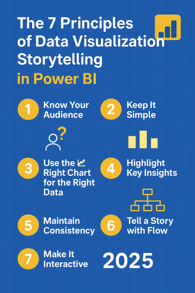
In this guide, we explore the 7 essential principles of data visualization storytelling in Power BI that will elevate your reports from mere data dumps to professional, actionable narratives.
Before creating any visual, stop and ask: Who will use this report, and what decision must they make? An executive needs a strategic overview, focusing on high-level KPIs (e.g., Profit Margin, YTD Sales). An operations analyst needs granular trends and detailed transactional data. Tailoring your visuals to the decision-maker’s cognitive load ensures the message is absorbed instantly. Never present a technical deep-dive to the CEO.
Clutter is the enemy of clarity. The goal is to maximize the data-to-ink ratio—meaning, every visual element must serve a purpose. Avoid using excessive colors, complex backgrounds, or too many duplicate visuals. A clean, spacious layout (often achieved using negative space) reduces the audience's cognitive effort and directs their attention immediately to the core insight. If a visual element doesn't aid understanding, remove it.
Choosing the correct chart type ensures clarity and avoids misinterpretation. The wrong choice can actively mislead your audience.
A good story doesn't bury the lead. Use Power BI’s built-in features to draw the audience's eye directly to the most important takeaways.
Inconsistency breaks trust and professionalism. Your dashboard should adhere to a strict style guide.
A dashboard should guide the user through a logical narrative flow, often following a Z-pattern or F-pattern reading structure.
Interactivity is what makes a Power BI report superior to a static image. It turns passive viewers into active explorers of the data.
Data storytelling is the most valuable skill a modern analyst possesses. It is not just about showing numbers; it’s about framing an argument that forces a decision. By diligently applying these 7 principles of visualization storytelling in Power BI, you can reliably transform raw datasets into clear, meaningful narratives that drive tangible business action.
Whether you're starting or upgrading your tech skills, you can begin your learning journey with us today.
Review Affordable Tech Course with us at ECR Academy We provide the hands-on, project-focused training you need to master tech skills like Digital Marketing, Web development, Data Analysis, Cybersecurity.
Build Comprehensive Digital Solutions with ECR Technology Services Limited Let us help you bring your brand, business, or idea online with professional digital solutions such as secure, responsive websites, robust mobile applications, high-impact digital marketing templates, and specialized Learning Management Systems (LMS).
Contact Us Today:
Frequently Asked Questions
It helps transform raw data into meaningful insights that influence decisions.
Simplicity, interactivity, and clear alignment with business goals.
Yes, but don’t overdo it—use interactivity where it enhances understanding.
Match your chart to your data type (trends, comparisons, proportions, geography).
Absolutely! These principles are simple yet powerful for both beginners and advanced users.
SOPHIA OLISE
Data Analyst
Olise Sophia Amarachi is a passionate and purpose-driven data analyst and digital skills advocate based in Nigeria. With a strong foundation in Excel, Power BI, and SQL, she empowers others—especially young people and corps members—through practical training, tech mentorship, and values-based leadership. Sophia’s journey into data analysis began during her NYSC year in Abia State, where she committed herself to learning and growing from scratch. Today, she shares her knowledge through online classes, challenges, and hands-on projects, including dashboards and reports that translate complex data into clear insights.
0 comment